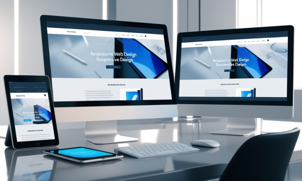
Best practices for responsive web design. Websites are now accessed through various gadgets, each with a different screen size.
This is where a responsive web design comes in; it allows the website to fit any device, be it a smartphone, tablet, or desktop computer that a visitor may be using. With a responsive site, users’ needs will be met, rankings will be improved, and the number of converted prospects will rise subsequently.
This article focuses on the fundamental rules of filling a responsive website, emphasizing effective techniques and important factors to remember.
Key Takeaways
- Responsive design involves more than just adjusting screen size; it includes flexible grids, images, and media queries.
- Mobile-first design is a strategic approach that prioritizes mobile users and scales up for larger devices.
- Optimizing images and other media files ensures quicker load times and better performance.
- Touch-friendly design elements are essential for usability on touchscreen devices.
- Testing on multiple devices and platforms is critical to ensure consistency and functionality across all devices.
Why Responsive Web Design Matters
The practice of responsive web design is no longer a matter of choice.
Considering that more than fifty percent of all internet activities are performed using mobile devices, making web pages mobile-friendly has become extremely important; otherwise, users may be lost and their engagement lowered.
Further, the Google search engine operates with mobile-first indexing websites so that the mobile version is prioritized for ranking and indexing, which also affects the search engine’s visibility and traffic.
Responsive web design also enhances users’ overall experience.
People appreciate websites that change according to their users’ preferences and are less likely to bounce away from such sites. Less zooming, panning, and scrolling are needed for such a site, which makes it more usable and reachable.
Core Principles of Responsive Web Design
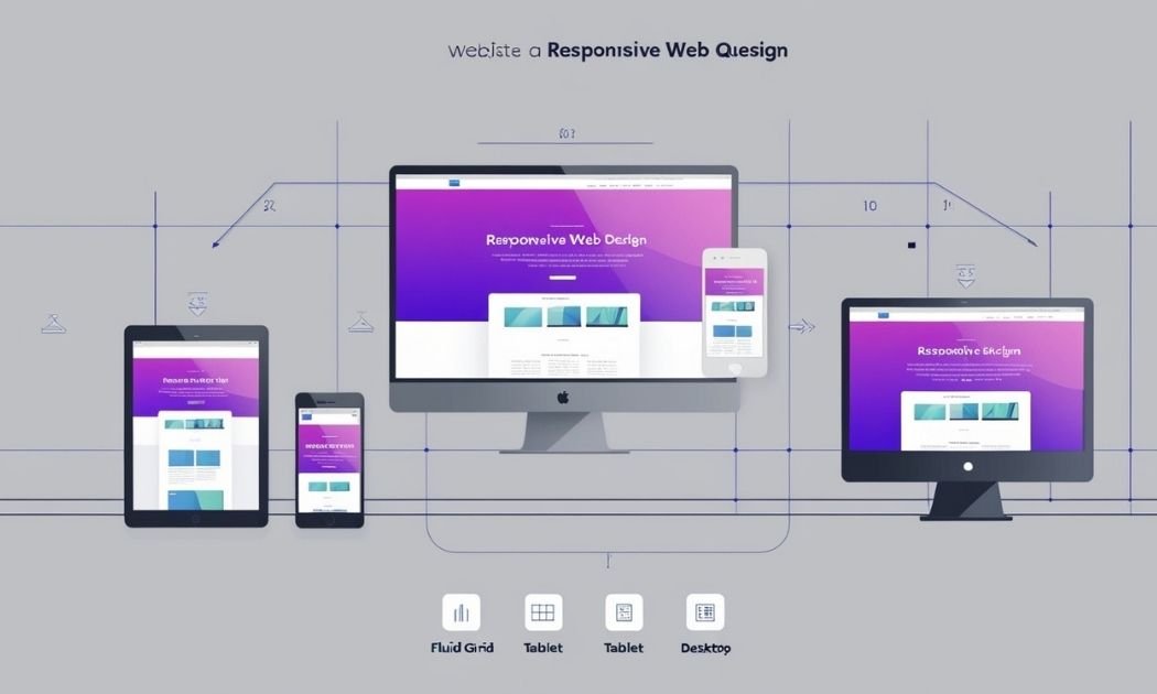
Responsive web design consists of three principles: fluid grid, flexible images, and media query. Each is important in ensuring compatibility across a range of screen sizes.
Fluid Grids
Fluid grids replace absolute layouts fixed in pixels with flexible layouts defined using relative units of measurement, such as percentages. In achieving coherence in proportion, it is also necessary to help avoid forcing elements to obey certain fixed sizes by making it possible to resize appropriately based on screen size. Fluid grids are characterized by their ability to offer such profits because of their structure and have thus proved effective in developing responsive designs.
Flexible Images
Images need to resize within their containers as per the screen size ideally. This is usually done with CSS properties like max-width: 100%; which help to resize the images while maintaining the aspect ratio of the image. Also flexible images help to solve the problem of having large media files over a smaller screen by providing clearer, less cluttered visuals.
Media Queries
Media queries are a powerful tool that assist web designers in implementing CSS methodologies targeting particular features of the device in use such as the screen width, resolution or the orientation of the device. It is advisable to set the breakpoints in order to help create suitable experiences for different devices. For instance, media queries may come in hand to increase font size for larger devices and decrease or completely change the appearance of navigation menu for mobile devices.
| Principle | Description | Example |
|---|---|---|
| Fluid Grids | Use of relative units for layout widths | Percentage-based widths |
| Flexible Images | Images that scale with their containers | max-width: 100%; |
| Media Queries | CSS rules based on device characteristics | @media (max-width: 600px) |
The Mobile-First Approach
Mobile device design entails focusing on the smallest screen, that of a mobile phone, and afterward scaling up the designs.
This approach ensures that the website’s basic elements are catered for a mobile audience before additional features targeting bigger screens are integrated. With the large number of internet users accessing the web through their mobile devices, the mobile-first design approach allows the basic features to be retained in the phone versions while they can be further built upon in the tablet and computer versions.
Benefits of Mobile-First Design
By taking a mobile-first approach, the practice has very high performance as well as ease of use optimization metrics.
When working on a mobile device with processors that could be very weak relative to the task in mind or when the available network is limited, the designers are under great pressure to trim down the actual site. This usually leads to shorter load time, less features and overall enhancement in user experience.
In addition, the mobile-first design is also compatible with Google mobile-first indexing, which is a plus in the ranking of the site in Google searches.
Implementing Mobile-First Design
In the mobile-first design strategy, proper implementation can be done if there is a clear structure from the outset. Identify the elements of content and their functions to achieve them with the minimum distance traveled in the mobile device. Add CSS media queries for layers and structural elements only to the larger screens as the site has minimum development and, therefore, a smaller screen.
This technique focuses on the mobile device so that when one is embarking on the desktop version of the site, it does not adversely affect the graphics and aspect ratios of the page.
Building Flexible Layouts and Grids
Layout structure is one of the key elements of responsive web design. Whenever there is a need for freedom around layouts, CSS Grid and Flexbox have made life pleasant and easy by allowing the beautiful placement of elements at any screen size.
CSS Grid and Flexbox
CSS Grid should be used when there is a requirement for two-dimensional placement of an object, i.e., controlling rows and columns together. It is commonly used in designs that have collections of items that require accurate placement like dashboards, portfolio sites etc.
Flexbox is most appropriate for arranging components in one dimension, like making a menu or footer, or for arranging contents in a simple layout. Both tools promote responsiveness by allowing colorful positioning of the components, going to the next line in case of less space, and realigning the elements as the space changes.
| Feature | CSS Grid | Flexbox |
|---|---|---|
| Layout | 2D (rows and columns) | 1D (row or column) |
| Use Case | Complex, grid-based layouts | Simple, linear layouts |
| Flexibility | Explicit control over the layout | Flexible alignment options |
Using Relative Units
While working on responsive designs, it is very important to avoid using fixed units like pixels and use relative units such as percentages, em, or rem. Relative units help to scale the elements appropriately when it is a different screen size. For instance, if column width is set to 50%, it is assumed that half of the container will be occupied irrespective of the device, which could be a small smartphone or a normal computer screen.
Media Queries and Breakpoints
Thanks to media queries, different layouts can be displayed depending on the device’s screen size, and so there are breakpoints where such adjustments are carried out. These breakpoints are determined by the width of the screen and may be applied based on the content instead of certain device sizes.
Defining Effective Breakpoints
Do not wait for such predefined breakpoints; study the website content and target breakpoints and content changes. For instance, when a three-column layout is somehow overflowing on small screens, one could use a media query and stop at a two-column layout at this point. On the contrary, users will be presented with a problem-free view irrespective of the kind of device they are using.
Applying Media Queries for Device Adaptability
Media queries can change font size, layout composition, image sizes, and other aspects of the design. For instance, a media query can remove a sidebar when viewed on mobile devices or make buttons bigger for easier usage on mobile devices with touch screens. These features aid the user in adapting to the internet changes by providing a functional appeal to the website.
Optimizing Images and Media for Responsiveness
Pictures are one of the most important components in websites, but they are also one of the main contributors to slow-loading web pages. For responsive design, images are addressed by specifying appropriate image formats, image compression, and responsive images.
Choosing the Right Image Format
Under usual situations, JPEG is the image file format that has been adopted by photographers mainly because it helps to reduce the image size by high compression of the pictures without affecting the quality of the pictures significantly. For images that need transparency, PNG will do while SVG for graphic icons and logos that needs to be drafted by manipulating the size without pixelating it. Every format has its benefits; hence, it should be used depending on the intended use of the image as well as its content.
| Format | Best for | Advantages | Disadvantages |
|---|---|---|---|
| JPEG | Photographs | High compression | Quality loss with compression |
| PNG | Transparent images | Supports transparency | Larger file size |
| SVG | Icons and logos | Scalable without quality loss | Not ideal for complex images |
Compressing Images and Using Responsive Attributes
It is important to compress images in order to minimize the file size efficiently. Tools such as tinyPNG and ImageOptim are often found to be useful when it comes to the compression of images. Also, responsive image elements like srcset and sizes enable the web browser to use the right image based on the resolution of the device’s screen.
This is beneficial in that the users using the mobile phones will not have to down large unnecessary images, which improves the speed and efficiency.
Designing for Touch Devices
As touch has become the input most used across mobile devices, it has necessitated the need for developing touch-compatible designs. For instance, buttons and links have to be reasonable sizes so that they can be tapped easily, with appropriate space between them to avoid mis-taps.
Ensuring Touch-Friendly Navigation
Apple’s Human Interface Guidelines recommend that buttons have a minimum target area of about 44px by 44px. This dimension surpasses the average size of a fingertip, which promotes an apex of enhanced interaction with the touch element. In addition to the above, leave adequate space when placing interactive elements, as putting them too close leads to annoyance and unintentional clicking.
Incorporating Gestures and Mobile Navigation
Gestural navigation is common on touch devices, with mechanisms like swipes and pinches. Implementing such gestures in your design is good practice in relevant cases. For instance, users might swipe their fingers over image galleries or pinch a map to zoom in, which is an enjoyable experience on a mobile device.
Responsive Typography and Font Sizing
Having so many styles and variants of a font will also increase the time it takes to load; hence, the fewer you have, the faster the load. Fonts such as Arial and Georgia are considered web safe and work well on many devices. Google Fonts also complements the available typography with a selection of fonts designed to be quick to load, thereby improving efficiency and looks at the same time.
Best Practices for Responsive Typography
Great responsive design goes well beyond the appearance of websites on various devices. Speed optimization is also necessary since slow web pages translate to high bounce rates and low interaction.
Limiting Font Variations for Performance
W3 Total Cache is the most efficient method of properly organizing a web page’s margins, layout, and other elements. Including the images in a multipurpose photo simplifies matters and reduces the overall load time for the page
Performance Optimization in Responsive Design
Merging files for stylesheets, scripts, and pictures minimizes the number of other files to be requested, thus decreasing the amount of time a page loads. In addition, caches allow the website to store pictures and draw scripts on the user’s computer or other portable devices, shortening the time it takes to load the next time a user returns to the site. Combined, all these measures make the site more interactive and accelerating.
Techniques for Improving Load Times
Testing should never be skipped, especially as the site has to support different types of devices. Because there are so many different screen outlines, all these supporting services, and also browsers, there should be a lot of testing to uncover too many underlying problems.
Reducing HTTP Requests and Leveraging Caching
There are ways to reduce the page load, such as combining files and sheeting CSS sprites. Gaping also helps prepare your site so that pictures, among other development tools, are created and saved on users’ devices, hence offering short page loading times on subsequent visits. Together, these techniques bring about more efficient and fast websites.
Testing and Debugging for Responsive Design
Testing ensures that your site works properly in all possible scenarios. This is important because test devices have different screen resolutions, operating systems, and browsers.
Using Browser DevTools and Online Tools
Then, you install Chrome or Firefox. Their DevTools contain device emulation features, which you can use to see how your site looks on other devices. Tools such as Browser Stack and Responsinator also help check how the website works on several devices.
Conducting User Testing for Real-World Feedback
Software emulators have limitations, and that is why testing virtually is always recommended to capture those usability challenges that may not be easily observable in a controlled setup. Using available devices for user feedback is a great way to improve your work by showing your design to actual users.
My Opinion
Responsive web design is one of the most important methods of developing sites oriented towards users’ requirements.
Following mentioned best practices by providing fluid grids, flexible images, responsive media, and performance enhancement on the websites will help all users enjoy the same experience on your site. Some further improvements to the design across devices are the changing and positioning of the users. Testing shows that such an order places great pressure on the working of application systems.